How to Make Your Real Estate Website Mobile-Friendly
6 March 2026
In today's digital world, your real estate website isn't just your online business card—it's your first impression, sales pitch, and open house all rolled into one. And with more than 60% of web traffic coming from mobile devices, having a mobile-friendly website isn’t optional; it’s essential.
Imagine this: A potential buyer is sitting in a coffee shop, casually scrolling through listings on their phone. They click on your site, but—uh-oh!—the text is too small, images take forever to load, and they have to pinch and zoom just to see basic details. Within seconds, they’ve bounced off to a competitor with a seamless, mobile-friendly experience.
If that sounds like your nightmare scenario, don’t worry. I’ve got you covered. Keep reading as we go step-by-step on how to make your real estate website optimized for mobile users, keeping buyers and sellers engaged and ready to do business with you. 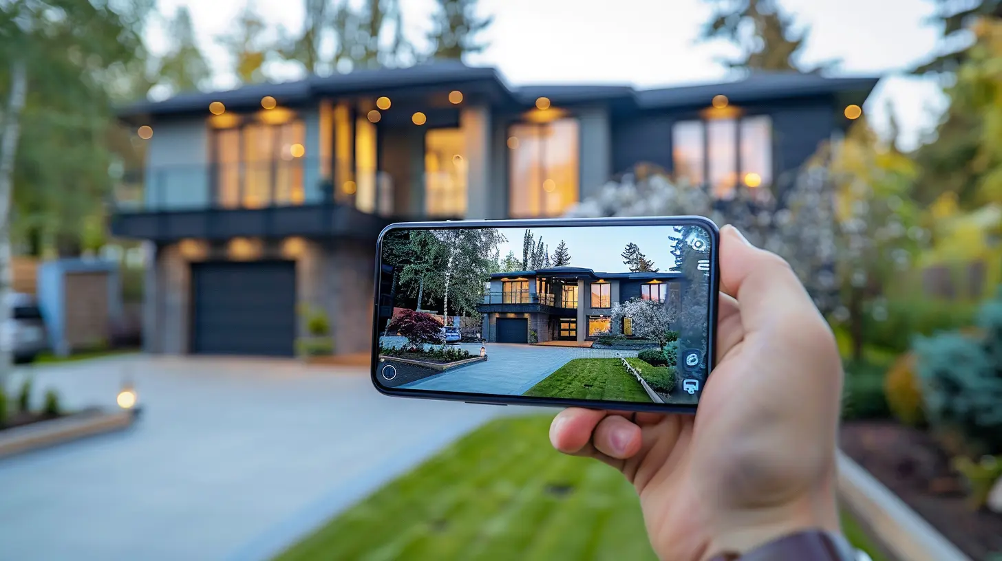
Why a Mobile-Friendly Website is a Game-Changer in Real Estate
Before diving into solutions, let’s talk about why this matters so much.1. Google Loves Mobile-Friendly Sites – If your site isn’t optimized for mobile, Google won’t rank it high in search results. That means less visibility for your listings.
2. Better User Experience (UX) – A smooth experience keeps visitors engaged and reduces bounce rates. The longer they stay, the better the chances of closing a deal.
3. Higher Conversion Rates – A well-optimized site makes it easy for users to contact you, schedule showings, and browse listings—leading to more leads and sales.
4. Faster Load Times – Mobile users are impatient. If your site takes forever to load, they’ll move on faster than a house in a hot market.
Alright, now that we know why it matters, let’s get into the HOW. 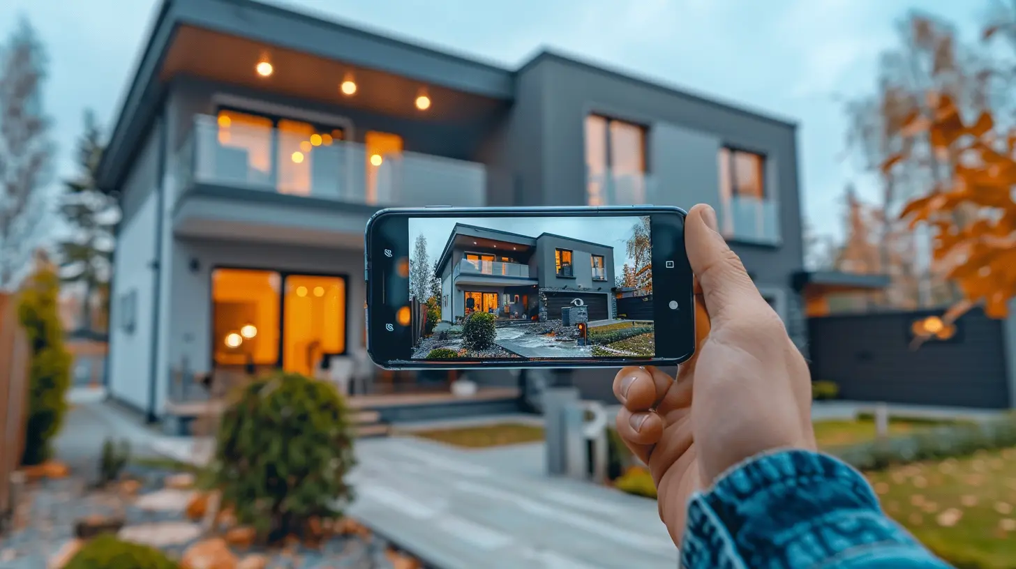
1. Use a Responsive Web Design
The first step in making your real estate website mobile-friendly is responsive design. What does that mean?A responsive website adjusts automatically based on the user’s device—whether it’s a desktop, tablet, or smartphone. This ensures that images, text, and buttons all resize proportionally so your website looks and functions perfectly on any screen.
How to Implement It:
✅ If you're using WordPress, choose a responsive real estate theme.✅ Work with a web developer to make sure your site layout adapts seamlessly.
✅ Test your site on different devices to ensure consistency.

2. Improve Your Page Load Speed
Nobody likes a slow website—especially mobile users. If your site takes more than 3 seconds to load, you risk losing visitors.Speed-Boosting Tips:
- Optimize Images – Large images slow down your site. Use compressed images without losing quality.- Enable Browser Caching – This saves some data on the visitor’s device, making pages load faster on return visits.
- Minimize HTTP Requests – Reduce the number of elements (such as images, scripts, and stylesheets) that load on a page.
- Use a Content Delivery Network (CDN) – A CDN helps serve content faster from servers located closer to the user.
Pro Tip: Use Google’s PageSpeed Insights to analyze your site's loading time and get actionable suggestions. 
3. Optimize for Touchscreen Navigation
Remember, mobile users navigate with their fingers, not a mouse. That means:- Buttons should be large enough to tap easily.
- Menu items should be spaced out to prevent accidental clicks.
- Forms should be easy to type on a small screen.
Quick Fix: Test your website by using your own smartphone. Is navigation smooth? Is the text readable without zooming? Is it easy to tap on links? If the answer to any of these is “No,” it’s time to tweak your design.
4. Use Mobile-Friendly Fonts and Readable Text
Nothing turns visitors away faster than tiny, unreadable text. If users have to pinch and zoom just to read your content, they won’t stick around.Best Practices:
🔹 Use fonts that are clear and legible (sans-serif fonts like Arial, Roboto, or Open Sans work great).🔹 Keep font sizes at 16px or larger for body text.
🔹 Maintain proper contrast between text and background for readability.
Simple tweaks like these can dramatically improve the mobile experience.
5. Simplify Your Website’s Navigation
A cluttered menu is frustrating—especially on a small mobile screen. Your visitors should be able to find what they need within a few taps.How to Streamline Navigation:
✅ Use a hamburger menu (those three stacked lines) to keep it clean.✅ Prioritize essential pages—Home, Listings, About, and Contact.
✅ Add a sticky navigation bar, so menu options stay visible while scrolling.
By keeping it simple, users will stay longer and explore more.
6. Optimize Property Listing Pages for Mobile
Your property listings are the heart and soul of your real estate website. If they don’t load properly on mobile, you’re losing leads.Must-Haves for Mobile-Friendly Listings:
✔ High-Quality, Compressed Images – Ensure images look stunning without slowing down the page.✔ Easy Scrollable Galleries – Users should be able to swipe through pictures effortlessly.
✔ Clickable Call-to-Actions (CTAs) – Buttons like "Schedule a Viewing" or "Contact Agent" should be clear and easily clickable.
✔ Fast-Loading Property Videos – If you include videos, host them on a fast-loading platform like YouTube or Vimeo.
Focus on visual appeal and ease of use to keep buyers engaged.
7. Implement Click-to-Call and Quick Contact Features
When a buyer or seller is browsing your site on their phone, they should be able to contact you instantly. Don’t make them copy-paste your phone number.How to Make Contact Easier:
📞 Add a click-to-call button – Just one tap and they’re calling you.💬 Include a WhatsApp or chat feature for instant messaging.
📩 Use short, mobile-friendly contact forms that don’t ask for too much information.
8. Leverage AMP (Accelerated Mobile Pages)
AMP technology helps web pages load almost instantly on mobile devices. Google even prioritizes AMP-enabled pages in mobile search results.How to Add AMP:
- If you're using WordPress, install the AMP plugin- Work with a developer to create AMP versions of your most important pages
This is especially useful for blog posts and property listings, where loading speed is crucial.
9. Test Your Mobile-Friendliness Regularly
Even after making these changes, you need to regularly test how your site performs on mobile.📱 Use Google’s Mobile-Friendly Test to check if your site is optimized.
🔍 Browse your site on different devices to spot issues firsthand.
By continuously tweaking and improving, you’ll keep your real estate website ahead of the competition.
Final Thoughts
A mobile-friendly real estate website isn’t just nice to have—it’s a must-have. Buyers and sellers expect a smooth, fast, and seamless experience on their phones. By ensuring your site is responsive, fast-loading, easy to navigate, and optimized for touchscreen interaction, you’ll attract more leads, rank higher on Google, and close more deals.So, take the time to optimize your site. Your future clients (and your bottom line) will thank you!
all images in this post were generated using AI tools
Category:
Real Estate MarketingAuthor:

Travis Lozano
Discussion
rate this article
2 comments
Zephyrae Cross
Great tips! Ensuring mobile-friendliness is essential for reaching today’s on-the-go homebuyers effectively.
March 21, 2026 at 5:40 AM
Travis Lozano
Thanks for the feedback! Mobile-friendliness is indeed crucial for connecting with homebuyers.
Sebastian Blevins
Making your real estate website mobile-friendly is like serving ice cream on a hot summer day—absolutely essential! Just imagine potential buyers browsing listings while sipping lemonade on the go. Don’t let outdated designs turn away your next big sale; refresh, revamp, and let the magic happen!
March 6, 2026 at 11:38 AM
Travis Lozano
Absolutely! A mobile-friendly real estate website is crucial for attracting buyers wherever they are. Refreshing your design ensures you keep up with their needs and enhance their browsing experience.